An Over-Engineered Travel Blog
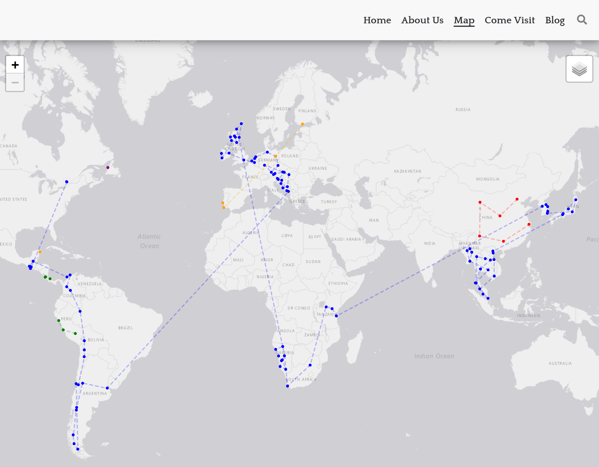
Most people would just have a pin board to hang on the wall and track their travels by adding new pins for each trip; I have a custom ReactJS component which plots trips from a set of JSON files acting as a sort of database.
I created kevinandsam.travel back in 2018 when my partner and I quit our jobs to follow our dream of backpacking around the world. We traveled to 31 countries across 4 continents over the course of 14 months - the experience of a lifetime. I often worked on the site among other projects along with some consulting work in the downtime between destinations. I loved being a nomad but I also realized that too much work can detract from the true purpose of long-term travel and I would encourage anyone considering this lifestyle to save up more and work less.
The site is built with GatsbyJS. I’d used a couple of static site tools in the past (Middleman and Jekyll for this blog) and I wanted to try something new this time. Gatsby caught my attention because of how it combines React, server side rendering, rehydration and preloading for subsequent page navigation. This blog achieves a similar result using Turbolinks on top of Jekyll but it is cool to see this functionality as part of the framework.
The framework delivered great performance which is best illustrated through a typical user visit:
- The first page loads a completely server rendered HTML page with inlined CSS and an initial JS bundle. For kevinandsam.travel the home page is 16kb of HTML and ~100kb of Javascript. Thanks to rehydration the app behaves like a React app going forwards.
- Hovering over the “Map” link in the nav bar preloads 3 more Javascript files and a page data JSON file. These files total ~60kb and include the additional Javascript required for the Map. If we inspect the files we can see most of the size is coming from leaflet.
- For comparison if we hover over “About Us” only two Javascript files totalling ~10kb are preloaded.
- When a link is clicked the navigation to the new page is quick and smooth because the data and code has been pre-fetched.
More important than the measured performance the site feels fast thanks to smart animation of the content. Anecdotally it is fast everywhere in the world - at least everywhere I’ve tried  .
.
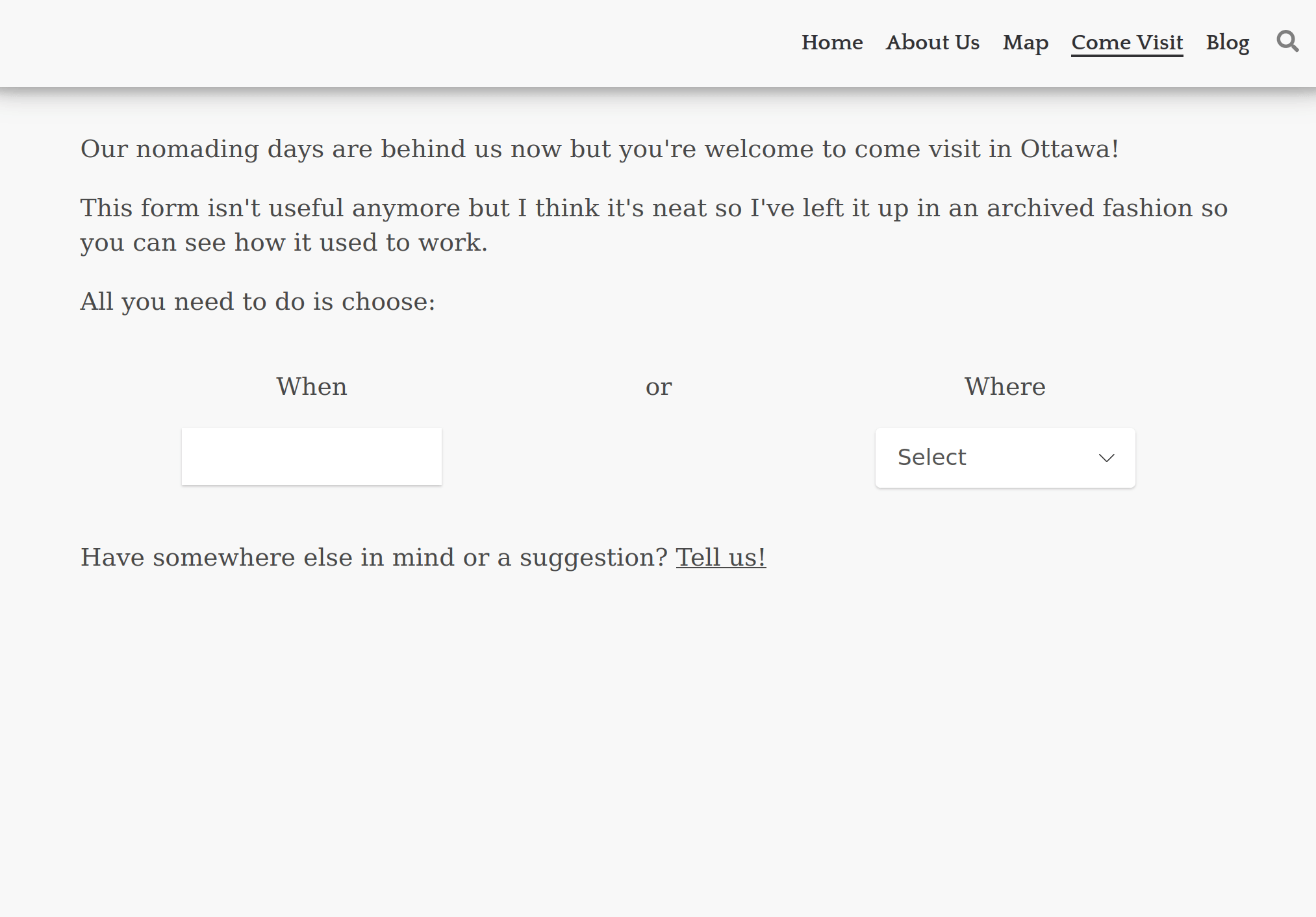
Another reason I picked Gatsby is React itself. I had a few features in mind for the site which I knew would be easier to build using open source components. In my opinion, this is one of the main benefits of React, especially for solo projects or small teams, it is so much better and easier to grab off the shelf UI pieces and integrate them than in the old jquery days. One of these features is the Come Visit form which has a country dropdown and a datepicker powered by the same data that draws the map.
Having our route data in a structured JSON format was also useful for planning while we were travelling. I had a few scripts I used to quickly convert dates into durations at each location. It was often much easier to think in terms of how many days we wanted to spend somewhere than in dates. This script enabled an iterative workflow where I could print the durations while tweaking dates and see where everything landed. This was also useful to arrange meeting people in certain places and times as well as managing seasonal constraints.
Another nice feature of Gatsby is the image plugins. The site is very image heavy and the framework handles pre-processing and resizing of images at build time which makes it easier to manage assets. I can commit the full size images and then resize appropriately during the build but crucially it is easy to change the size at any time. Gatsby also automatically creates inlined placeholders for images while they load for a nice effect.
Later in the development, I added custom markdown components with rehype (and even later migrated to MDX) which after a mildly painful setup made writing posts featuring advanced layouts and photo carousels a blast. Overall, I have been pretty happy with the framework - I got the result and performance I wanted but occasionally I did have to fight with confusing build errors.
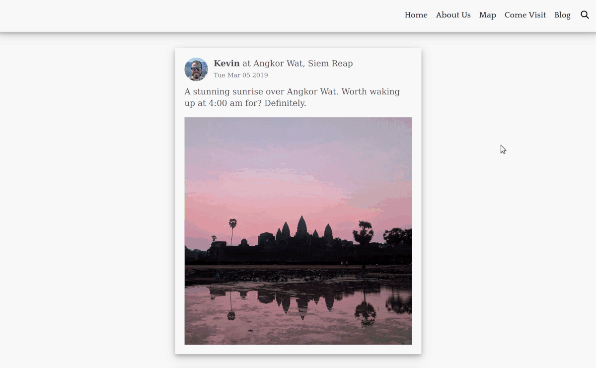
The newest addition to the blog is a re-presentation of our social media posts from our trip. While I have mixed feelings about social media, I value the content we shared about our journey and the connections it facilitated. To reduce my dependence on these platforms I decided to preserve the posts that matter to me on my own blog. This way I can maintain control over the content and have one less reason to keep my accounts.
I started by exporting my data and rebuilding my Facebook feed. I’ve used a few of these export tools and I am always impressed with the data I receive back, it wasn’t a drop in but with a minimal python script I could easily filter and transform the data into something appropriate for a Gatsby source. The initial feed was pretty straight forward to build thanks to react-photo-album and Gatsbygram for an infinite scroll example. The toughest part was drawing a nice arc on the map for the “travelling to” posts. After getting my cloned feed working I was able to take things further and add functionality to search, filter and change the order.
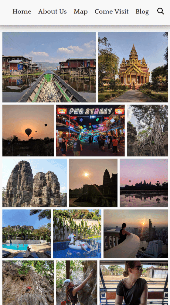
Instagram was the harder of the two to build. I re-used quite a bit of the import logic and basic component setup but the modal I wanted required new state and logic. Getting the styling right and maximising the space used by the image in all possible aspect ratios was a challenge and took longer than I’d like to admit. I was able to leverage react-photo-album again along with react-responsive-carousel and an underlying library for swipe events to build a mobile and desktop friendly instagram-esque page on our site.
Afterwards, I generalized the infinite scroll pattern with a higher order component and added search to the original blog section of the site. Search could be further abstracted to remove some duplication present in each of the components but I am happy enough with the implementation for now.
I enjoyed revisiting these old posts and exploring my data in this way. It served as a fun but admittedly odd way to reminisce about our time travelling. The recent push to finish these features also motivated me to finally open source the site and share more about the process of building it. You can check out all the code on github at kevinhughes27/kevinandsam.travel; sometimes I even wrote PRs to myself  .
.
If you made it all the way here thank you for reading, and I hope this post has inspired you to build for yourself, for fun, or simply because you can.